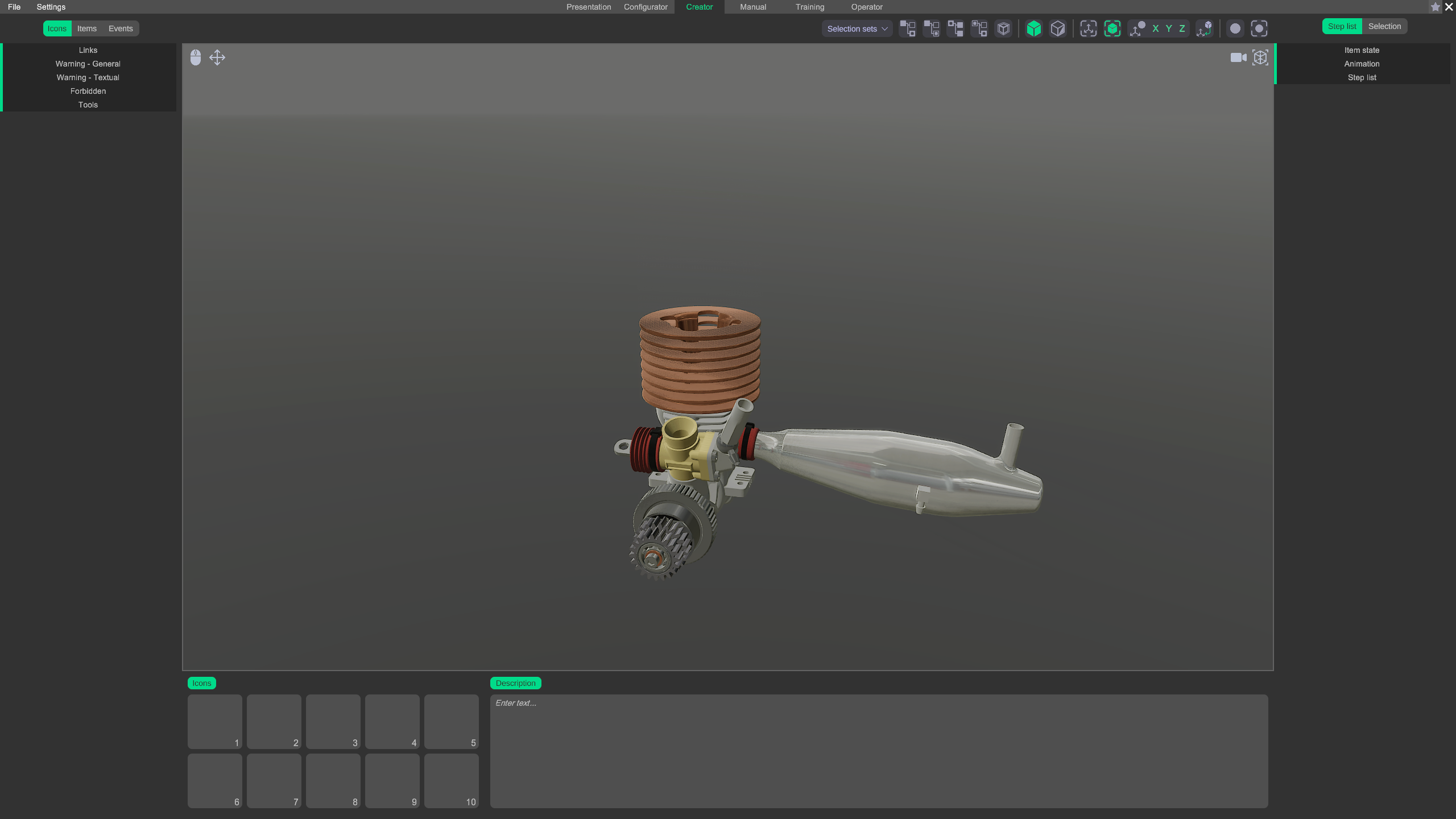
Creator
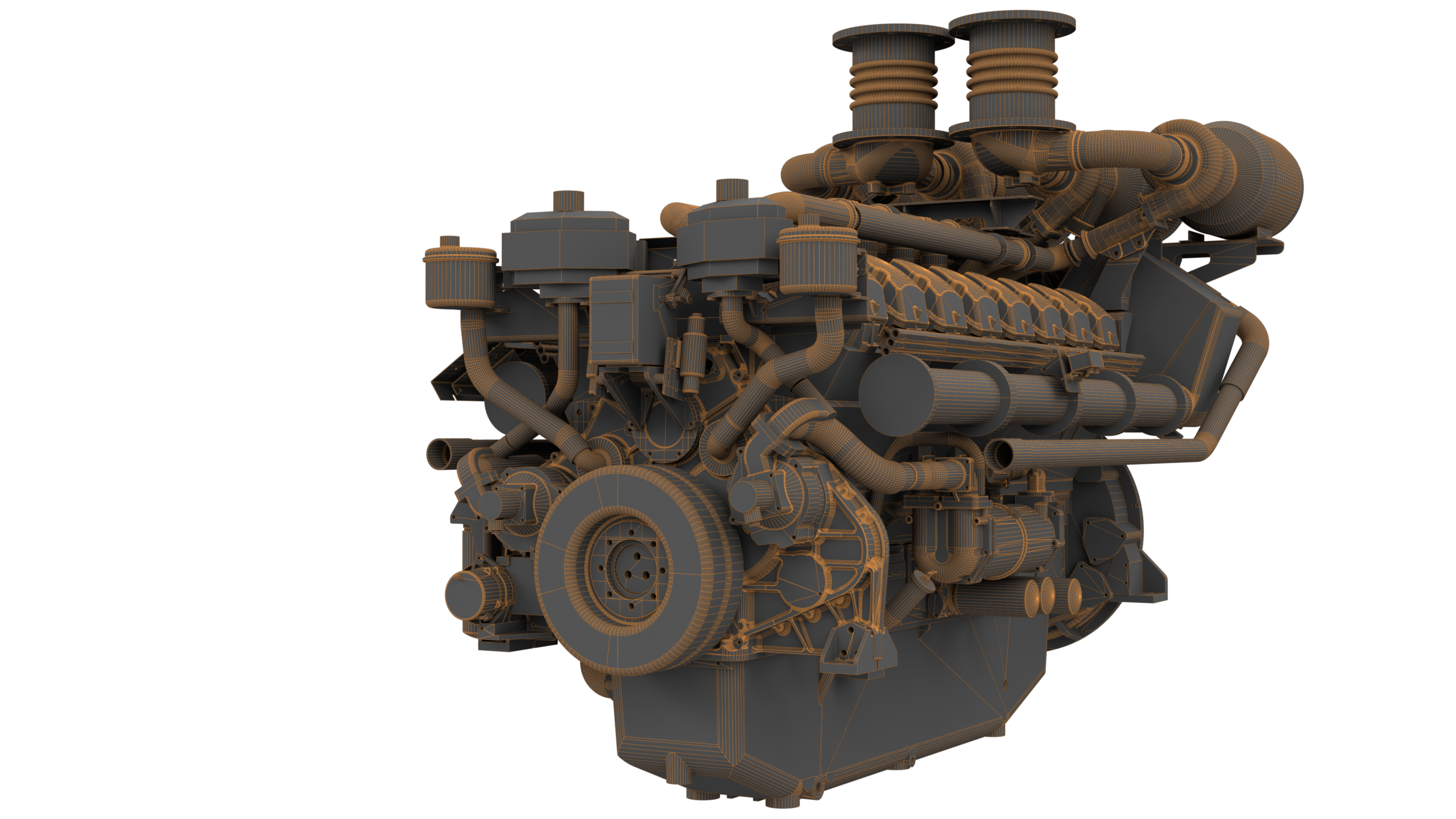
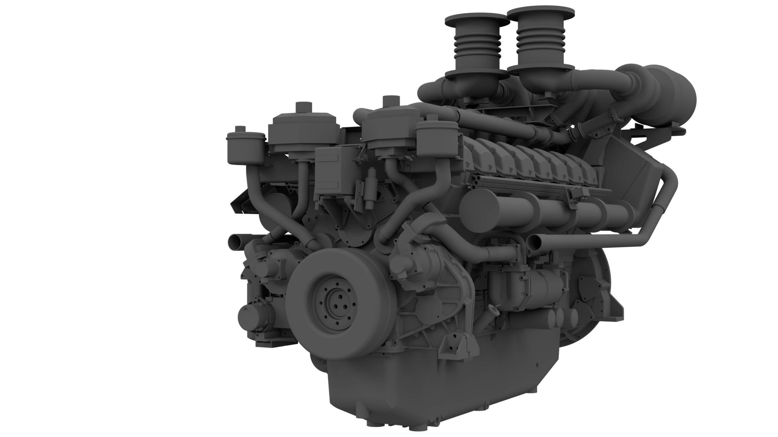
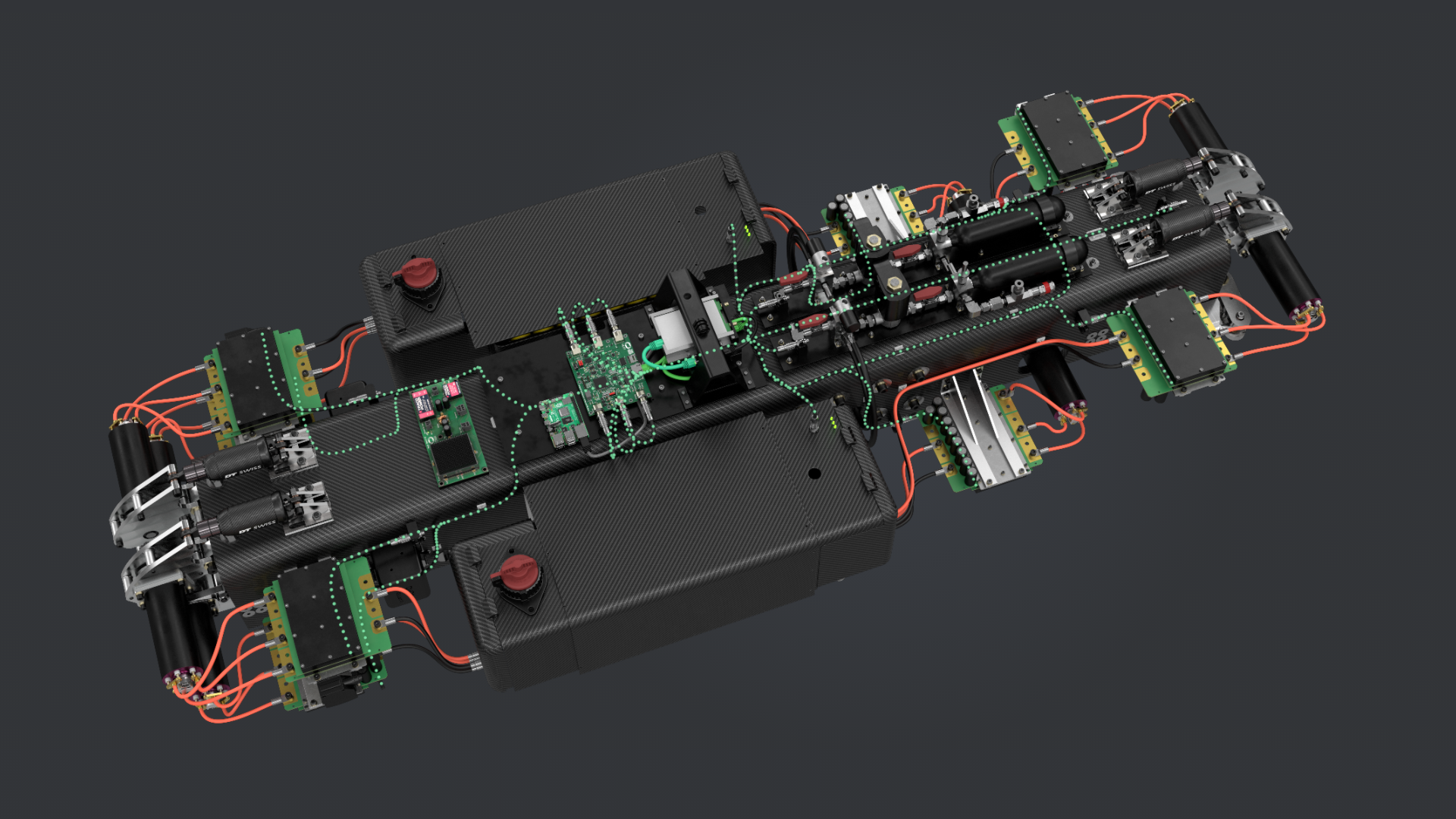
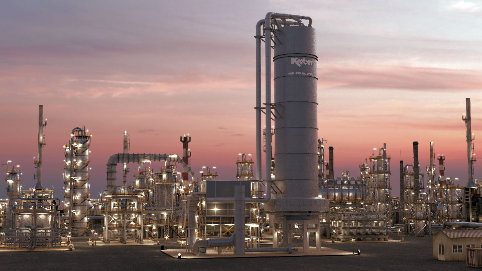
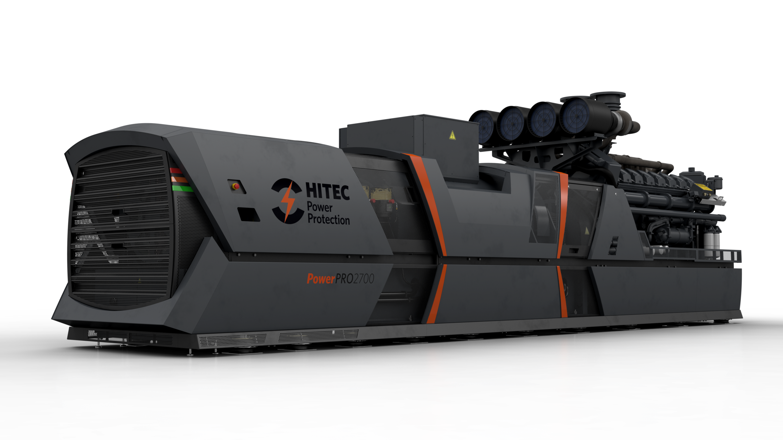
Tijdens het importeren van de 3D CAD data hebben wij complete controle over de nauwkeurigheid van de geometrie. Dit is essentieel om hoge kwaliteit technische animatie of beelden te genereren.
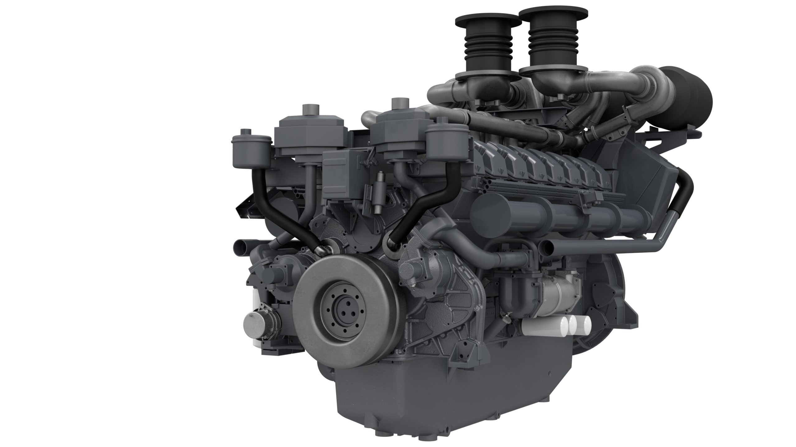
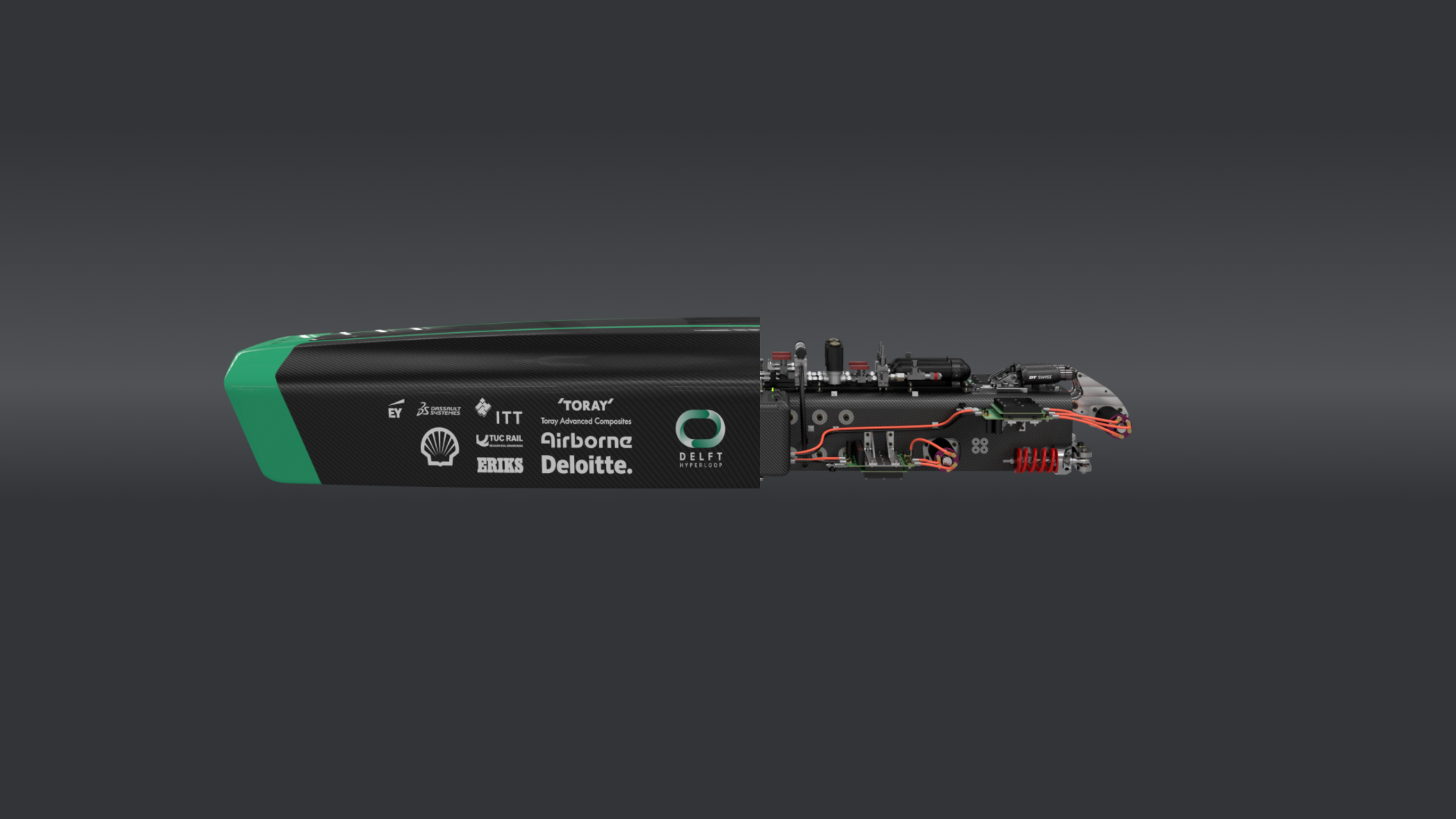
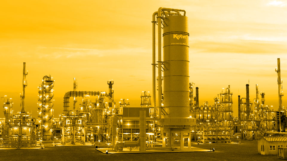
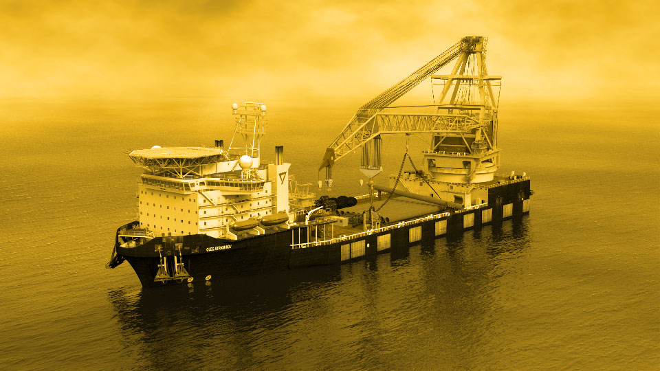
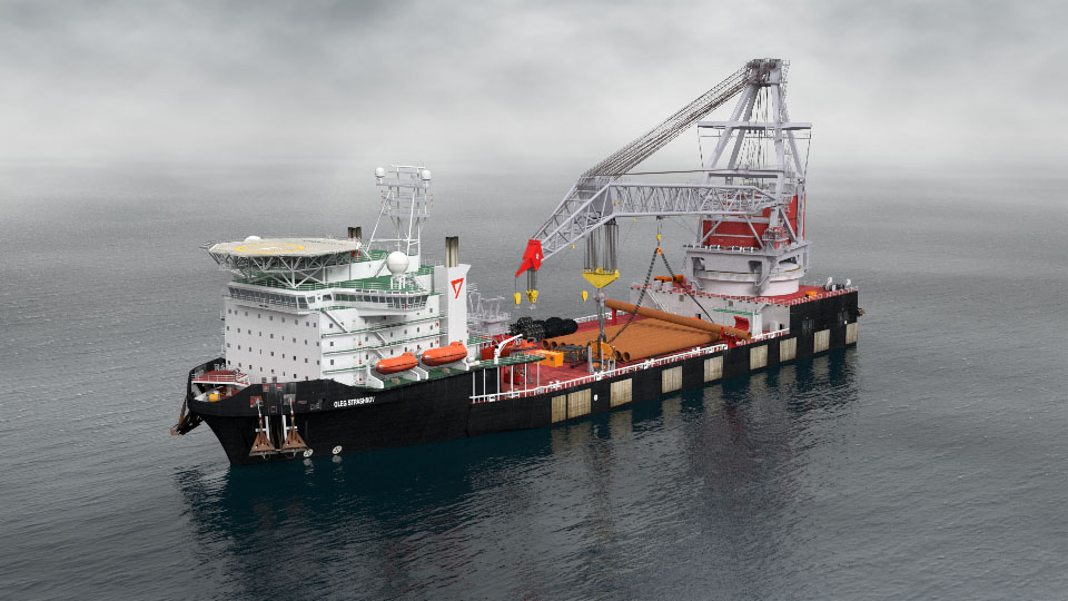
Met behulp van geavanceerde belichting, materielen en rendering technieken kunnen wij fotorealistische beelden genereren voor digitale platformpagina’s voor de technische industrie. Wij maken onze platformen modulair met diverse elementen. De hoeveelheid elementen die op uw pagina kunnen is afhankelijk van uw abonnement.
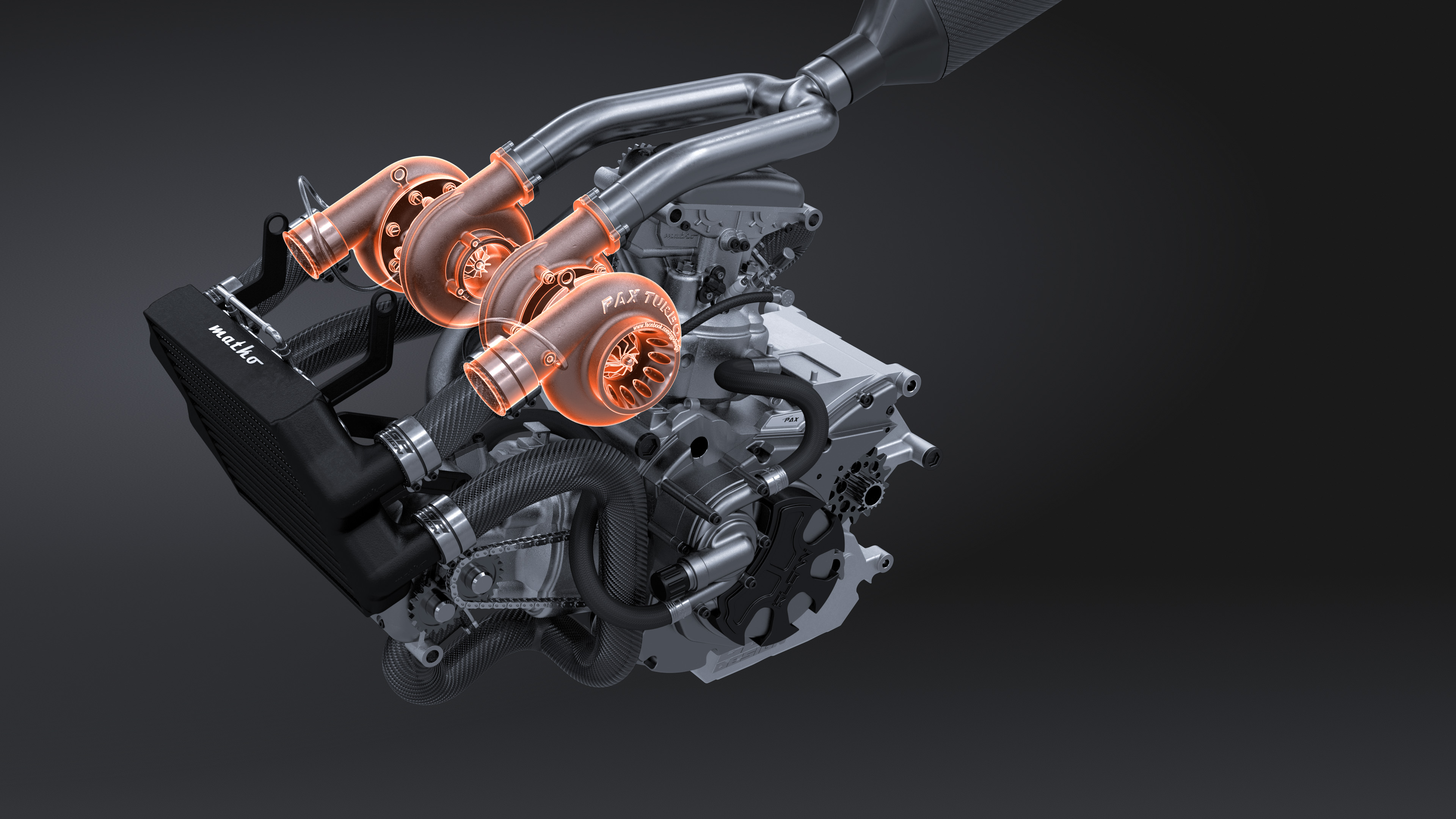
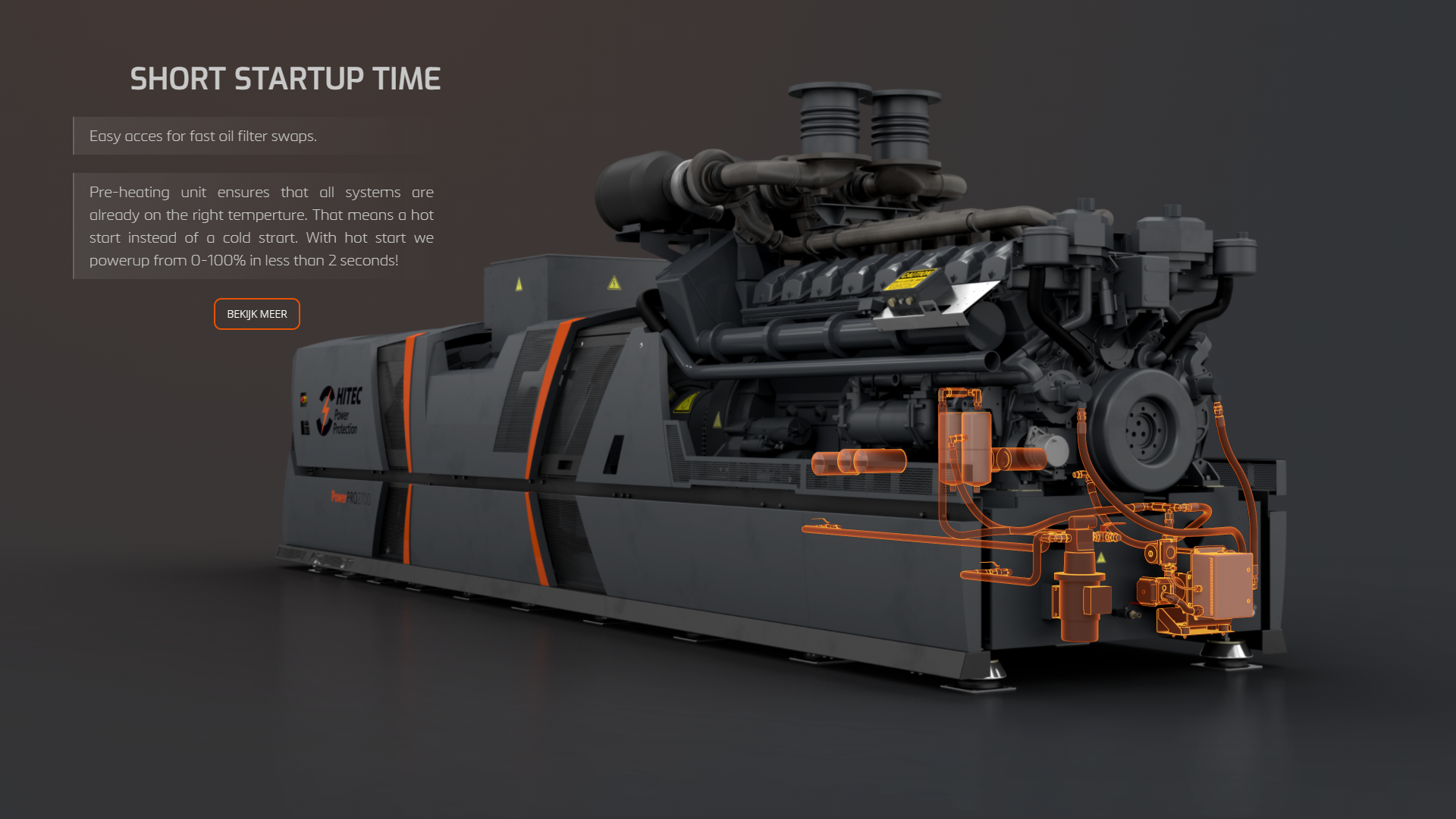
Met technische animatie kunnen we onderdelen of secties van machines op laten lichten door middel van highlights. visualiseer de USP's met dit modulaire element.
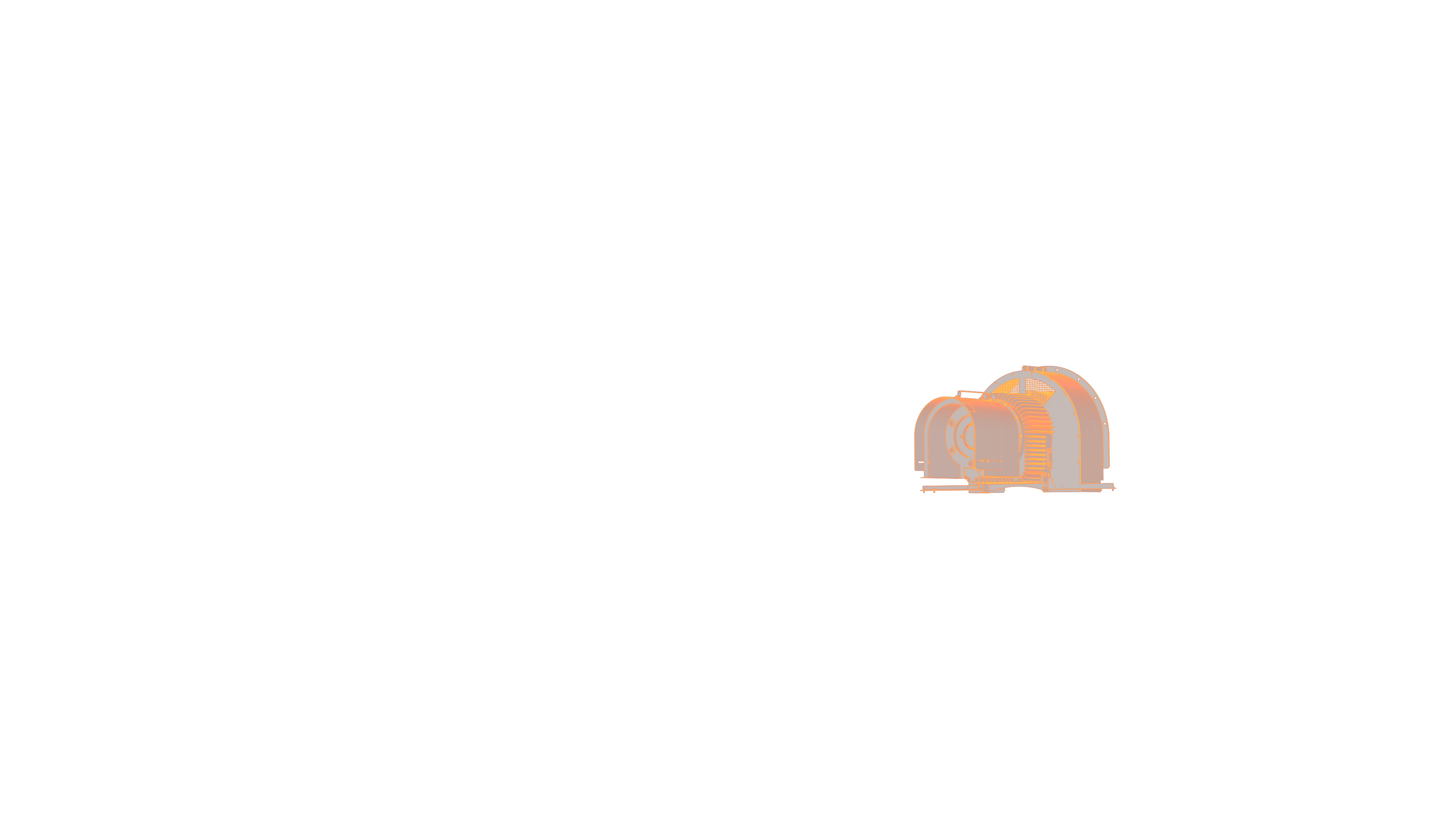
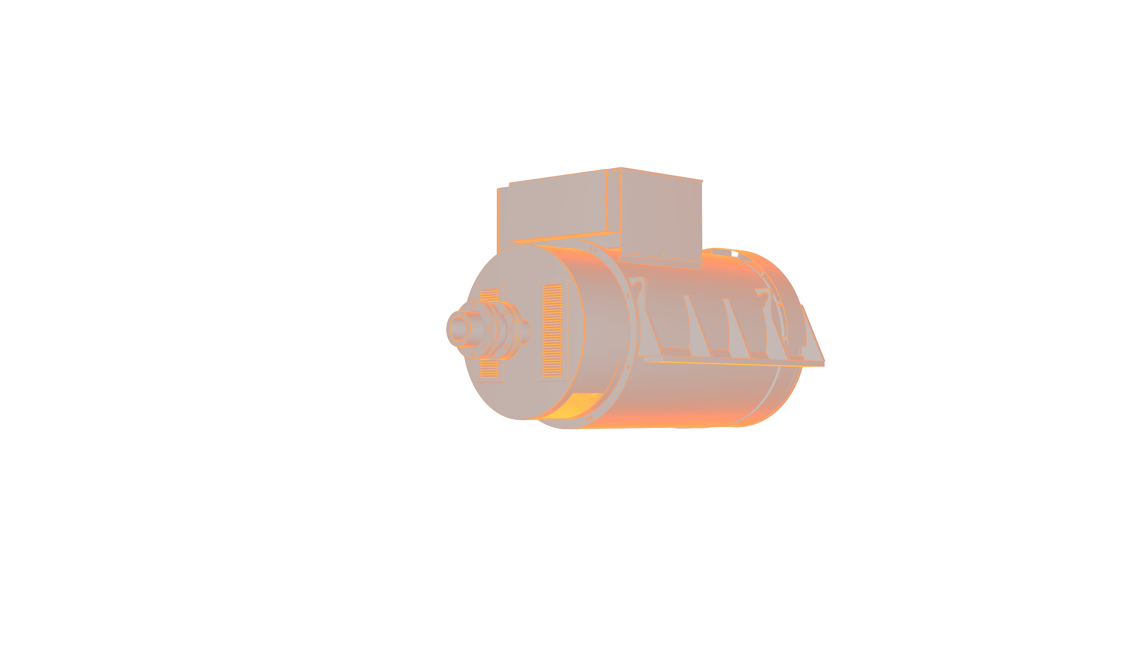
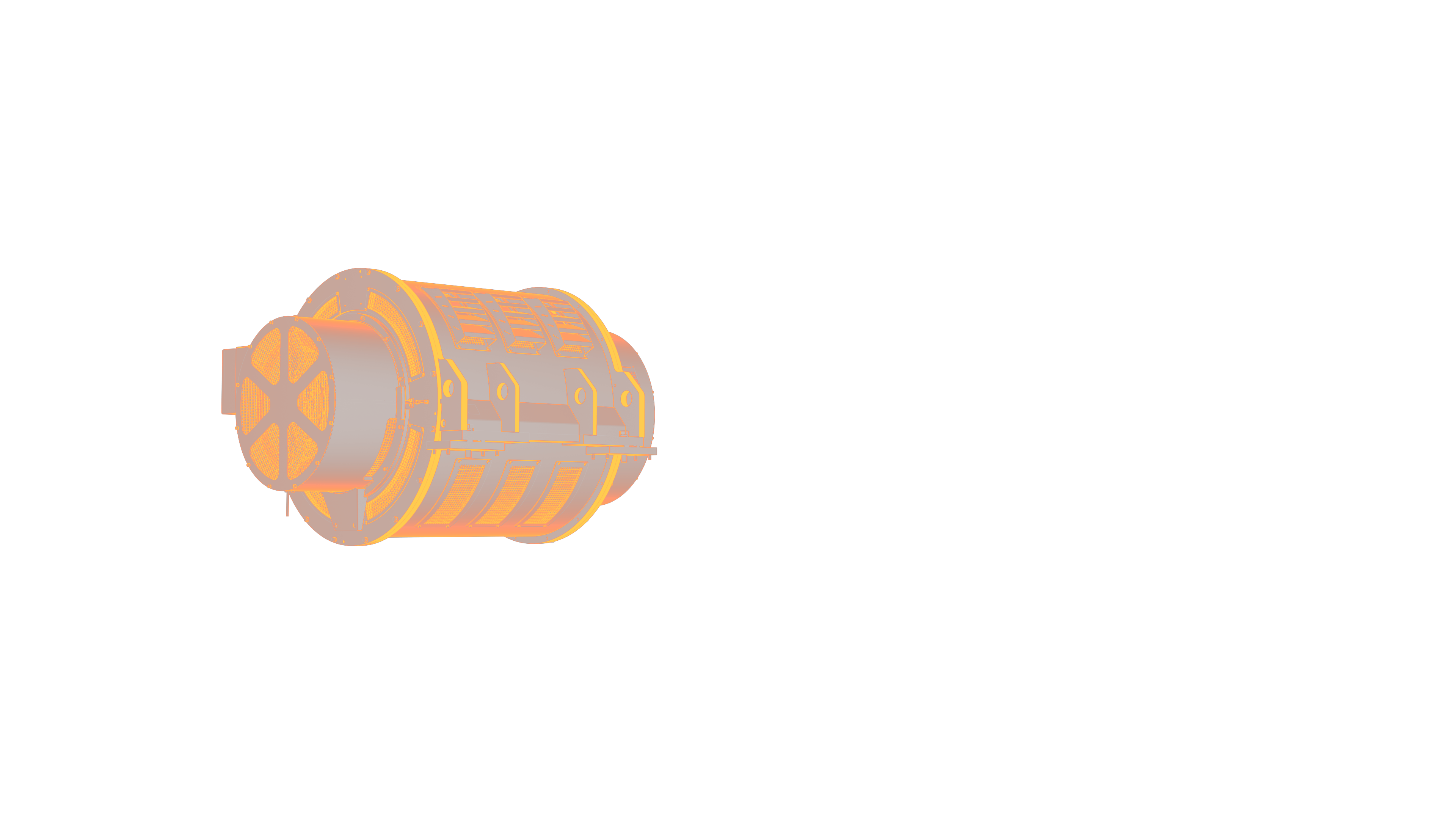
Dit is bijvoorbeeld de tweede highlight layer van het element: Fade Highlight 2-layer | Text: Right.
bedrijf.presents2u.com/project
De naam van uw bedrijf is uniek. Wanneer u uw bedrijf registreert voegen wij een hosting pakket toe zodat u direct met uw platform kunt starten.
bedrijf.presents2u.com/project
Presents2U is de naam van dit presentatie platform.
bedrijf.presents2u.com/project
Projecten kunnen machines, systemen of producten zijn. Wij gebruiken technische animatie en moderne webtechnologie om modulaire elementen voor uw project presentatie te maken.

Met dit element kunt u de USP’s aanduiden met knoppen. Als deze Point Of Interest knoppen (POI) worden getriggered vervaagt het beeld naar grijs en een systeem of onderdeel word opgelicht. Dit type interactieve animatie is erg toepasselijk in een systeem overzicht.
Type:
Actions:
Max. POI:
USP (Points-Of-Interest)
Desktop: Mouse hover / Mobile: Tap
10

Dit element heeft een overlappende laag met tekst aan de rechterkant. Wanneer de gebruiker verder scrolt kunnen verschillende onderdelen worden opgelicht. Markeer uw USP’s met dit element.
Type:
Actie:
Max. lagen:
USP (Markering TR)
Desktop: scroll | Mobile: swipe
5 (Aanbevolen: 2)
Dit element heeft een overlappende laag met tekst aan de linkerkant. Wanneer de gebruiker verder scrolt kunnen verschillende onderdelen worden opgelicht. Markeer uw USP’s met dit element.
Type:
Actie:
Max. lagen:
USP (Markering TL)
Desktop: scroll | Mobile: swipe
5 (Aanbevolen: 2)
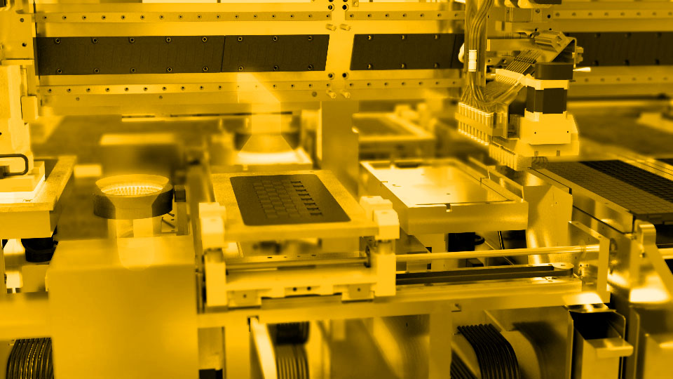
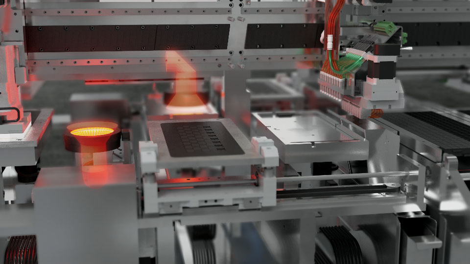
Dit element is een korte animatie van de werking van een (sub)systeem. Hiermee kunt u de werking van een (sub)systeem tonen.
Type:
Actie:
Max. lengte
USP (Animatie)
Desktop: scroll | Mobile: swipe
25 beelden
Dit element is een korte animatie van een (sub)systeem dat op scrollbasis in of uit elkaar explodeert. Laat hiermee zien hoe verschillende subsystemen een geheel maken.
Type:
Actie:
Max. lengte:
USP (Animatie)
Desktop: scroll | Mobile: swipe
25 beelden
Dit element visualiseert stromingen van onzichtbare (elektrische) of moeilijk zichtbare (vloeistof) systemen. De stroming kan bewegen om stroomrichting aan te duiden.
Type:
Actie:
Max. lagen:
USP (Stroming)
Desktop: N/A | Mobile: N/A
2 (Achtergrond + stroming)
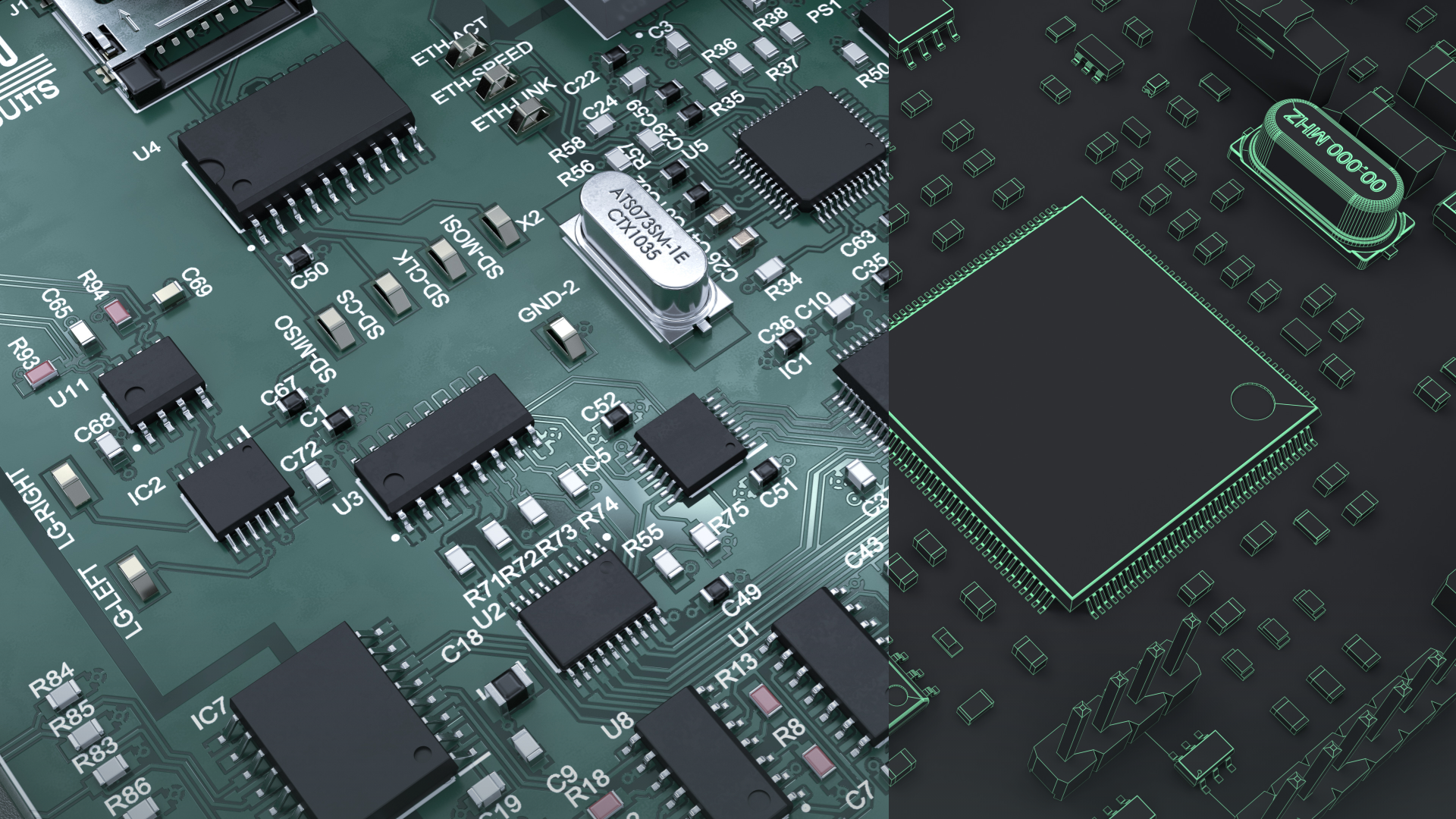
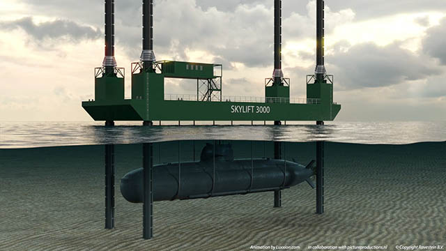
Met dit element kunt u 2 beelden met elkaar vergelijken door ze over elkaar heen te schuiven. Vergelijk bijvoorbeeld fotorealistisch beeld met 3D CAD beeld.
Type:
Actions:
Max. lagen:
USP (beeld slider)
Desktop: Scroll | Mobile: Swipe
2 (achtergrond + vergelijking)
Met dit element kunt u interne (sub)systemen tonen en bedekken door middel van animatie. Hiermee kunt u makkelijk de binnenkant met de buitenkant vergelijken.
Type:
Actions:
Max. lagens:
USP (Slide Cover)
Desktop: Scroll | Mobile: Swipe
2 (achtergrond + vergelijking)

Dit element is de bovenste deel van uw pagina. Bezoekers kunnen vanaf hier naar door uw pagina’s navigeren. Dit kan ook gebruikt worden om door verschillende secties van uw technische presentatie te navigeren.
Type:
Actie:
Max. menus:
Menu
Desktop: Click | Mobile: Tap
2 per project
Deze elementen zijn de tekst op uw pagina. De tekst in de blokken worden automatisch aangepast aan het type apparaat dat wordt gebruikt.
Type:
Actie:
Max. blokken:
Tekst blok
Desktop: N/A | Mobile: N/A
5 blokken per rij

Deze elementen nemen de bezoeker naar door u geselecteerde pagina’s. Dit kunnen specifieke secties van uw pagina zijn, of externe websites door middel van de URL.
Type:
Actie:
Max. knoppen:
Link blok
Desktop: Click | Mobile: Tap
5 links per rij
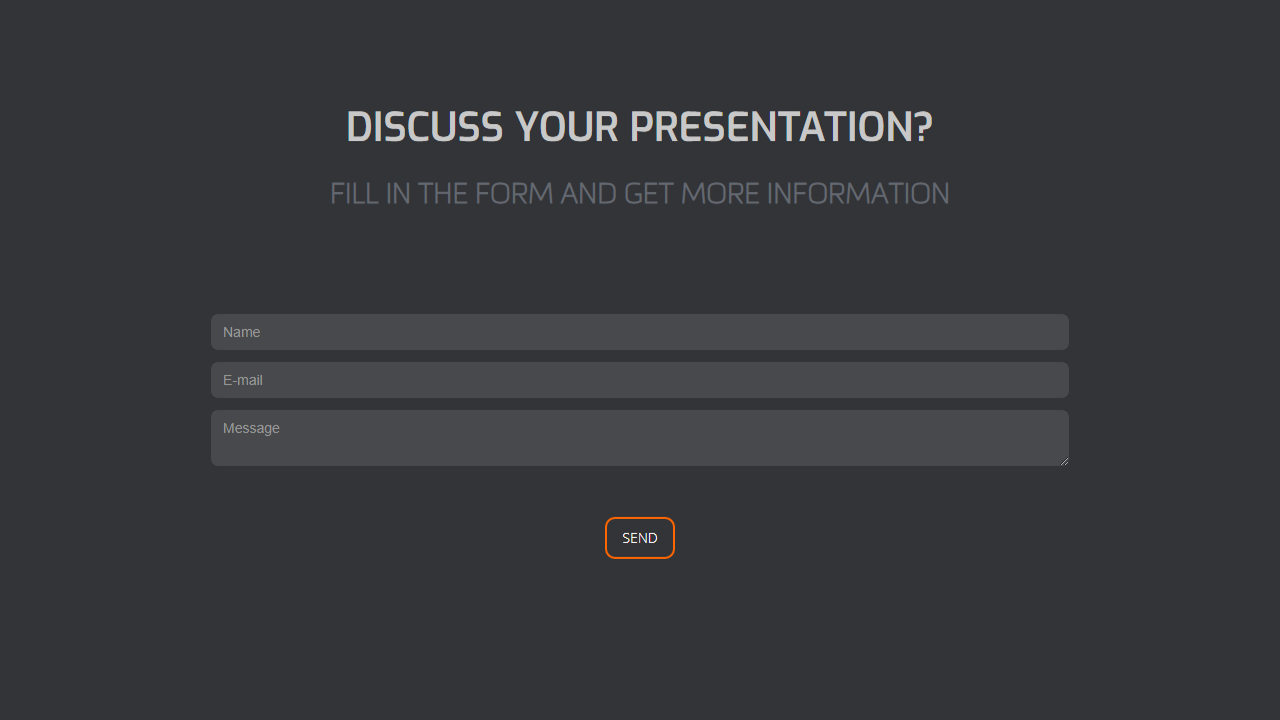
Via dit element kunnen bezoekers rechtstreeks vanaf uw pagina contact opnemen. Uontvangt de berichten in uw email inbox.
Type:
Actie:
Max. formulieren:
Formulier
Desktop: N/A | Mobile: N/A
2 per project
Met deze elementen kunt u afbeelding aan uw pagina toevoegen. Dit kunnen foto’s of 3D renders zijn.
Type:
Actie:
Max. afbeeldingen:
Afbeelding
Desktop: N/A | Mobile: N/A
2 per project

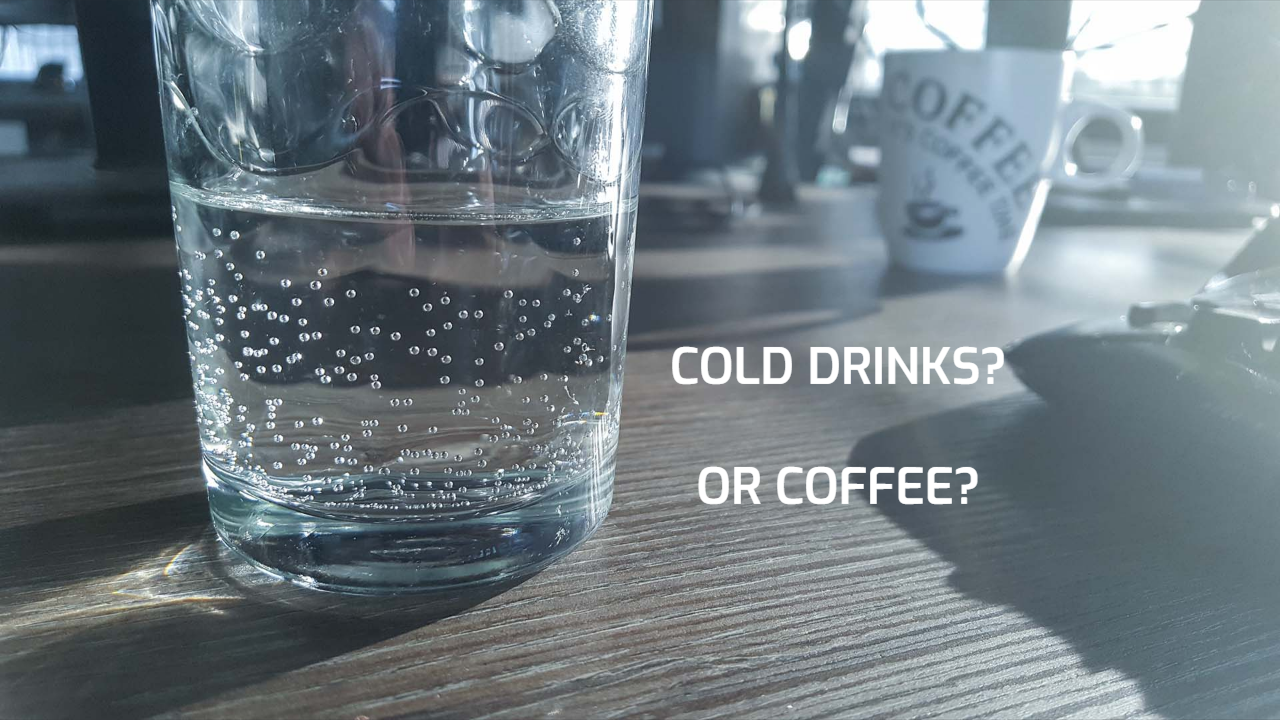
Met deze elementen kunt u video’s aan uw pagina toevoegen. Dit kunnen echte video’s zijn of computer animaties.
Type:
Actie:
Max. videos:
Video
Desktop: N/A | Mobile: N/A
2 per project
Dit element is de footer van uw pagina. Hier kunt u uw bedrijfsinformatie tonen, of zelfs een klein contact formulier toevoegen.
Type:
Actions:
Max. voettekst:
Footer
Desktop: N/A | Mobile: N/A
1 per project


 websites
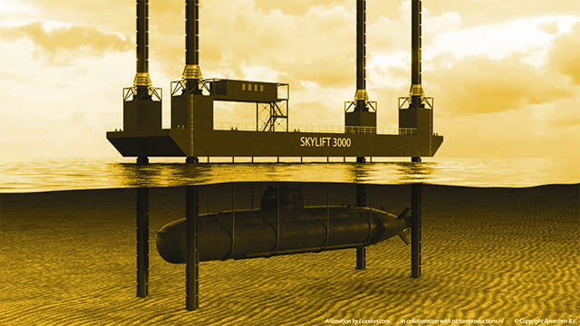

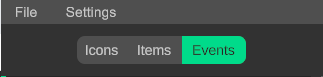
From this tab you can create steplists, selection lists and events.
Reset camera: Resets the camera to the default position.

Fit camera to selection: Zoom in to the selection.

Camera controls: Switch between mouse mode and touch mode.

Lock camera movement: Disable the movement of the camera.


Warning: Not every function of the creator tab is supported in touch screen mode!
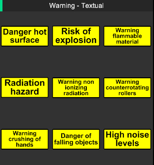
In here you will find a list of categorized icons that can be used to add warnings to the steps.
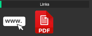
In this category you will find icons that are related to external links. e.g a webpage or a pdf document.
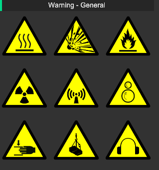
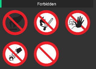
In this category you will find icons that are related to symbol warning signs.
In this category you will find icons that are related to text warning signs.
In this category you will find icons that are related to prohibition signs.
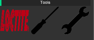
In this category you will find icons that are related to tools. e.g tools needed to complete a step.
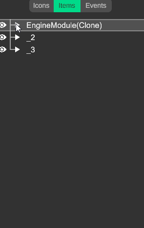
In here you will find the items in a tree hierarchy. Expand the parents by clicking on the triangle.

Here you can find the tools to move and select items in the configuration.
Selection related:
Add parents: Add the parents of the selected items to your selection.
Add children: Add the children of the selected items to your selection.
Deselect parents: Deselect the parents of the selected items in your selection.
Select parents: Select the parents of the selected items and deselect the current selected items.
Add parents and children: Add the parents and the children of the selected items to your selection.
Select highlighted: Select all highlighted parts in the scene.
Animation related:
Item mode: In this mode you can select items on item level.
Triangle mode: In this mode you can select items on triangle level.
Gizmo to center selection: By turning this on the gizmo will automatically stick to the center of your selection. Turn this off to move the gizmo outside the center of your selection.
Set gizmo to center selection: Set the gizmo in the center of your selection. e.g between 2 items or 2 triangles.
Set helper to center selection: Set the helper in the center of your selection. e.g between 2 items or 2 triangles.
Gizmo to helper position: Move the gizmo to the helper position. Useful when you need the gizmo to be outside your selection. Choose which axes you want to match (XYZ).
Bring selected object: By turning this on, the selected object will move with the gizmo's last set position.
Warning: Always turn off gizmo to center selection before attempting to move the gizmo!
Tip: Use the triangle mode to position the helper / gizmo on a surface!
Tip: Rotate items on pivots outside of the selection using the helper!
In this tab you can manage the events of your configuration. e.g the failure of a wear part.
From here you can create new events, link them to error codes, add a description, and link a step list with the solution.
Event code: Enter the error code here. e.g Error 1
Visual mark: Add a visual mark to locate the event position.
Description: Add a description for the event.
3D Event arrow: Enter the coordinates of a 3D arrow.
Toggle event arrow visibility: Turn the event arrow on or off.
Link step list: Link a step list to the current event.
Save event: Save the current event to the event list.
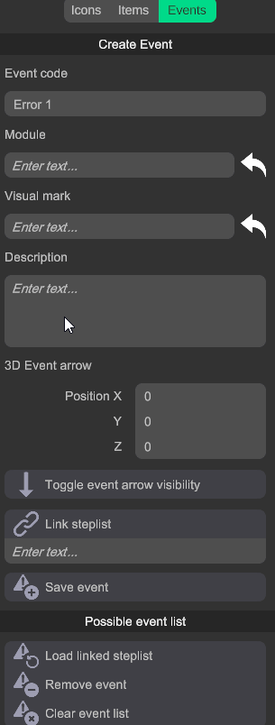
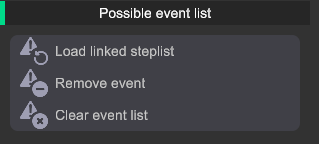
From here you can load the step lists linked to an event. You can also view exististing events, modify them, remove them, or clear the entire list.
Load linked step list: Load the step list that corresponds to the error code.
Remove event: Remove event from the list.
Clear event list: Remove all events from the list.
In here you will find everything related to the step lists.
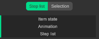
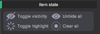
From here you can change the states of the selected items.
Toggle visibility: Hide or unhide the selected item.
Unhide all: Unhide all hidden item.
Toggle highlight: Highlight or dehighlight the selected item.
Clear highlights: Dehighlight all highlighted item.
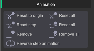
Here you can find the tools related to the step animations.
Reset: Resets the selected item to its original orientation.
Reset all: Resets all items to their original orientation.
Reset from step: Resets the selected item to the orientation of the previous step.
Reset all from step: Resets all items to the orientation of the previous step.
Remove: Remove the animation from the selected item.
Remove all: Remove the animation from all items.
Tip: Select an item and hit W for the move tool, and E for the rotation tool.
Tip: Press and hold shift while rotating, to make 15° adjustments.
These buttons open up the gizmos for translation and rotation. Select an item and translate or rotate it by dragging on the X Y or Z handles. Press and hold shift to rotate with 15° increments.
Tip: The transform gizmos only work in the item mode!
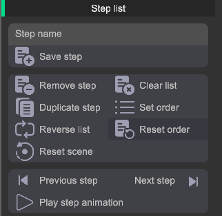
Here you can find the created steps in a list.
Remove step: Remove the selected step from the list.
Duplicate step: Duplicate the selected step in the list.
Set order: Set the current step list order as the correct order for training purposes.
Reset scene: Reset the scene to default, clear all highlights, unhide all parts, and remove all animations.
Clear list: Remove all the steps from the current list.
Reverse list: Reverse the order of the step list.
Reset order: Reset the order of the step list to the order set with the "set order" button.
Play step animation: Replay the animation within the current step.
Next step: Go to the next step.
Previous step: Go to the previous step.
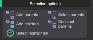
Here you will find everything related to selection and selection sets.
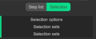
From here you can alter your current selection.
Add parents: Add the parents of the selected items to your selection.
Add children: Add the children of the selected items to your selection.
Deselect parents: Deselect the parents of the selected items in your selection.
Select parents: Select the parents of the selected items and deselect the current selected items.
Add parents and children: Add the parents and the children of the selected items to your selection.
Select highlighted: Select all highlighted parts in the scene.
From here you can manage your selection sets.
Save set: Save the current items in your selection to a set.
Add to set: Add the selected items to the current selection set.
Select set items: Select all the items from your current selection set.
Delete set: Delete the selected selection set.
Remove from set: Remove the selected items from the current selection set.
Delete all sets: Delete all the selection sets in the scene.
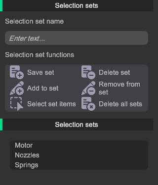
Tip: When created, a selection set will stay selected until you manually deselect it.
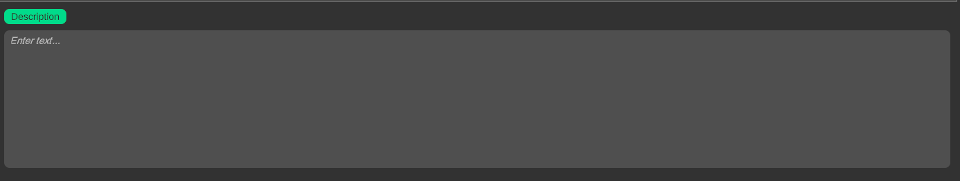
From here you can explain the steps or warnings in more detail.
Here you can add a description to explain a step in more detail. e.g fasten the bolt to 32 ft/lb.
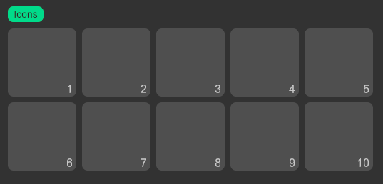
Here you can add icons related to the step.
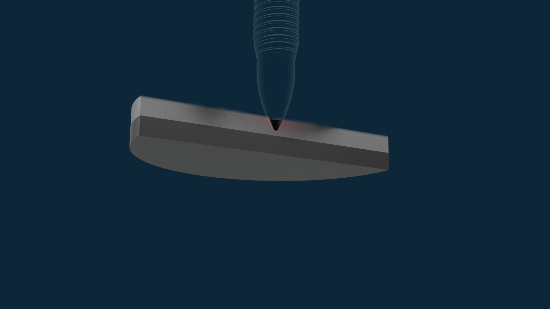


Heatup
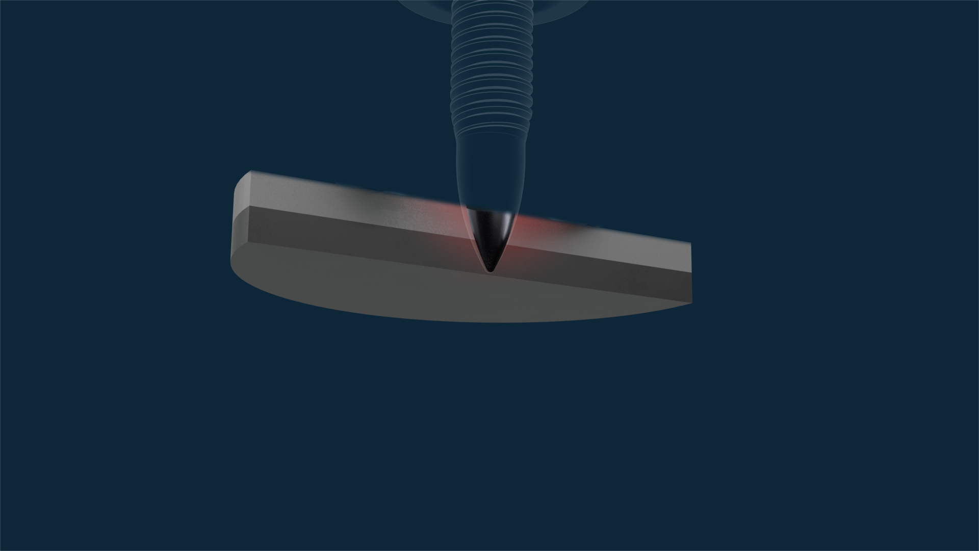
Form hole
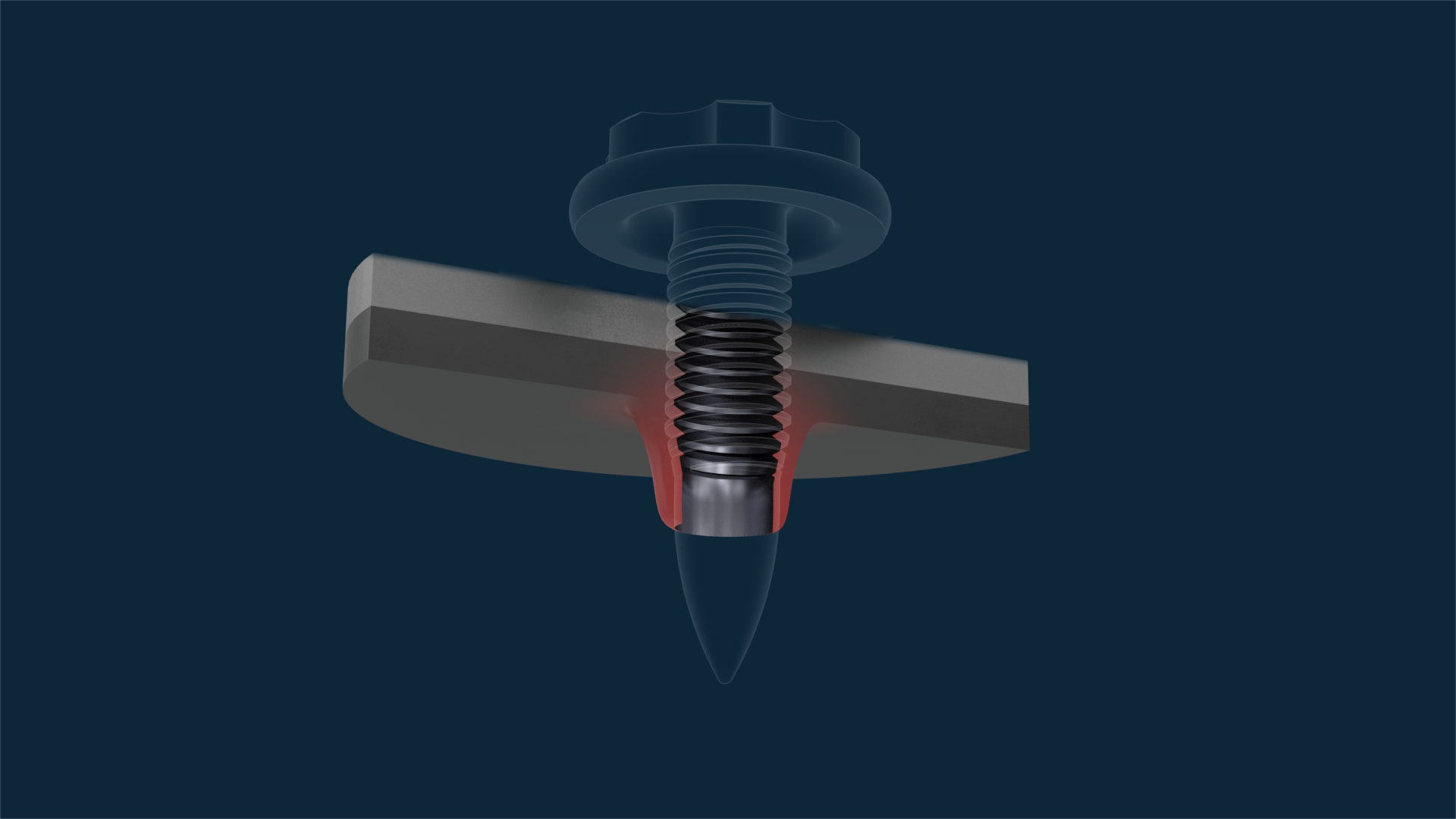
Form rim
Form thread
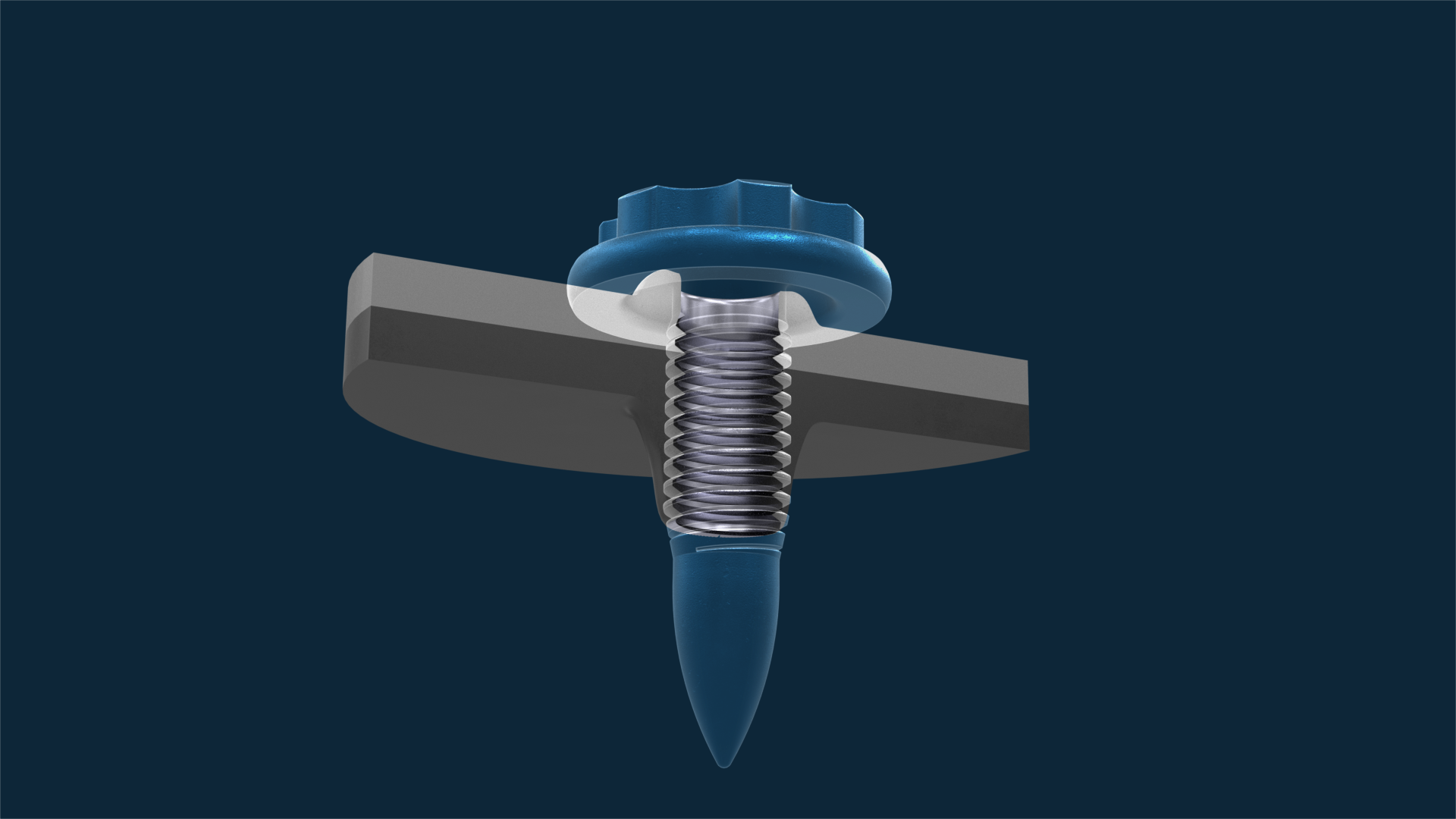
Screw in
Tighten